
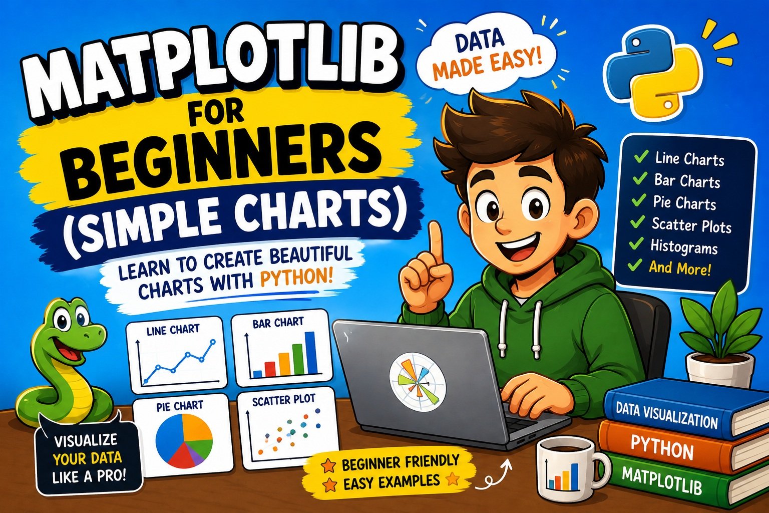
Matplotlib for Beginners: How to Create Simple Charts in Python (2026 Guide)
Picture this — you have a spreadsheet full of sales numbers, survey results, or temperature readings, and you want to understand what the data is actually saying. Numbers in a table are hard to read. A chart makes the pattern obvious in seconds.
That is exactly why data visualization is one of the most valuable skills a Python developer can have. And when it comes to creating charts in Python, there is one library that every beginner should learn first: Matplotlib.
In this complete Matplotlib for beginners guide, you will learn how to install the library, understand its core concepts, and build five practical chart types from scratch — all with working code, real-world examples, and beginner-friendly explanations.
By the end of this article, you will be able to create:
- Line charts to track trends over time
- Bar charts to compare categories
- Pie charts to show proportions
- Scatter plots to explore relationships
- Histograms to understand data distribution
This guide is fully updated for Matplotlib 3.11.0 (released June 2026) and compatible with Python 3.11 through 3.14.
Prerequisites: Basic Python knowledge (variables, lists, loops). No prior data science or math experience needed.
What Is Matplotlib?
Matplotlib is an open-source Python library for creating static, animated, and interactive data visualizations. It was originally built by neurobiologist John D. Hunter to visualize EEG brain data, and it has since grown into the most widely used plotting library in the Python ecosystem.
Today, Matplotlib powers charts in academic research, corporate dashboards, machine learning pipelines, and data journalism. If you have ever seen a Python-generated chart, there is a strong chance it was built with Matplotlib — or with a library built on top of it.
Why Matplotlib Is Worth Learning
- It is free and open-source, released under the Python Software Foundation License
- It produces publication-quality output in PNG, PDF, SVG, and more
- It works seamlessly with NumPy arrays and Pandas DataFrames
- It is the foundation that libraries like Seaborn and Pandas
.plot()are built upon - It supports Python 3.11, 3.12, 3.13, and 3.14
Understanding the Two Interfaces
Matplotlib gives you two ways to build charts:
1. The Pyplot Interface (beginner-friendly)
This is the matplotlib.pyplot module. It works like a step-by-step drawing tool — you call functions one at a time to build up the chart. This is where you will start.
import matplotlib.pyplot as plt

plt.plot([1, 2, 3], [4, 5, 6])
plt.title("My Chart")
plt.show()
2. The Object-Oriented Interface (more control)
This uses fig, ax = plt.subplots(). It gives you explicit control over every part of the figure and is the standard for professional and complex charts.
fig, ax = plt.subplots()
ax.plot([1, 2, 3], [4, 5, 6])
ax.set_title("My Chart")
plt.show()
For this beginner guide, you will primarily use the pyplot interface. Once you are comfortable, the OO interface will feel natural.
Anatomy of a Matplotlib Figure
Understanding these four components will make every chart much easier to read and customize:
| Component | What It Is |
|---|---|
| Figure | The overall canvas — the top-level container for everything |
| Axes | The actual plot area where your data is drawn |
| Axis | The x-axis and y-axis lines, ticks, and labels |
| Artists | Lines, bars, markers, text — the things drawn on the axes |
Think of it this way: the Figure is the picture frame, the Axes is the canvas inside the frame, and the Axis is the ruler along the edges.
Why Learn Matplotlib in 2026?
Data skills are in higher demand than ever. Whether you are studying data science, working in business analytics, or building machine learning models, knowing how to visualize data is non-negotiable.
Here is why Matplotlib specifically is still the right starting point in 2026:
- Matplotlib 3.11.0 (June 12, 2026) is the latest stable release, now with full internationalization support through an overhauled text and font processing system — your charts render correctly in any language
- The new
petroff10color cycle (added in 3.10) makes charts colorblind-accessible by default with one line of code - Matplotlib supports Python 3.11 through 3.14, including the experimental free-threaded build
- It is still the #1 visualization library listed in data science job descriptions
- Learning it first makes Seaborn, Pandas
.plot(), and other tools instantly easier to understand
If your work involves data — even occasionally — Matplotlib is a skill that pays for itself quickly. And if you are also working with data in DataFrames, the Pandas Tutorial for Beginners is a great companion to this guide.
How to Install Matplotlib (Step by Step)
What You Need Before You Start
- Python 3.11 or newer installed (python.org)
- pip (comes bundled with Python 3.x)
- A code editor: VS Code, PyCharm, or Jupyter Notebook all work well
Check your Python version first:
python --version
# or on macOS/Linux:
python3 --version
You should see Python 3.11.x or higher.
Install with pip (Recommended)
The official Matplotlib documentation recommends always upgrading pip before installing:
python -m pip install -U pip
python -m pip install -U matplotlib
Why
python -m pipinstead of justpip? Usingpython -m pipguarantees you install into the exact Python version you are currently using — especially important when multiple Python versions are installed on the same machine.
Verify the installation:
python -c "import matplotlib; print(matplotlib.__version__)"
Expected output: 3.11.0
Install Inside a Virtual Environment (Best Practice)
For any real project, you should install Matplotlib inside a virtual environment. This keeps your project dependencies isolated and prevents version conflicts between projects.
# Step 1: Create a virtual environment
python -m venv myenv

# Step 2: Activate it
# Windows:
myenv\Scripts\activate
# macOS / Linux:
source myenv/bin/activate

# Step 3: Install Matplotlib
pip install matplotlib
You will see (myenv) at the start of your terminal prompt, confirming the environment is active.
Beginner tip: If you see
ModuleNotFoundError: No module named 'matplotlib'after installing, your virtual environment is probably not activated. Re-run the activate command and try again.
Install for Jupyter Notebook
pip install notebook matplotlib
jupyter notebook
Then add this magic command at the top of your first cell to display charts inline:
%matplotlib inline
Install with Conda (Anaconda Users)
conda install matplotlib
Importing Matplotlib — Your First Two Lines
Every Matplotlib script starts with the same import:
import matplotlib.pyplot as plt
The plt alias is a universal convention used across the entire Python data science community. Do not change it — sticking to plt makes your code immediately readable to any Python developer.
Most chart examples also import NumPy, which is helpful for generating and manipulating numerical data:
import matplotlib.pyplot as plt
import numpy as np
NumPy is not required for basic charts with plain Python lists, but you will want it once you start working with arrays.
Your Very First Chart in Python
Let’s build the simplest possible chart to confirm everything is working:
import matplotlib.pyplot as plt

# Data
x = [1, 2, 3, 4, 5]
y = [10, 20, 15, 30, 25]

# Create the chart
plt.plot(x, y)

# Add labels and title
plt.title("My First Chart")
plt.xlabel("X Axis")
plt.ylabel("Y Axis")

# Display the chart
plt.show()
What each line does:
| Line | Purpose |
|---|---|
plt.plot(x, y) | Draws a line connecting the (x, y) data points |
plt.title(...) | Adds a title above the chart |
plt.xlabel(...) | Labels the horizontal axis |
plt.ylabel(...) | Labels the vertical axis |
plt.show() | Renders and displays the chart |
Output: A simple blue line rising from left to right, with a title and labeled axes.
⚠️ Common mistake: Forgetting
plt.show()in a regular.pyscript means nothing appears on screen. In Jupyter Notebook with%matplotlib inline, charts may display without it — but always include it in scripts to be safe.
Line Charts — Visualizing Trends Over Time
What Is a Line Chart?
A line chart connects individual data points with a continuous line. It is the go-to chart for showing how a value changes over time or across a sequence.
When to Use a Line Chart
- Monthly website traffic or revenue trends
- Daily temperature readings
- Progress tracking over weeks or months
- Stock price movements
Complete Code Example
import matplotlib.pyplot as plt

# Data: Monthly sales figures
months = ["Jan", "Feb", "Mar", "Apr", "May", "Jun"]
sales = [1200, 1500, 1300, 1700, 1600, 1900]

# Create the figure with a custom size
plt.figure(figsize=(9, 5))

# Plot the line with custom styling
plt.plot(
    months,
    sales,
    color="steelblue",   # line color
    linewidth=2,          # line thickness
    marker="o",           # circle marker at each data point
    markersize=8          # marker size
)

# Labels and title
plt.title("Monthly Sales — 2026", fontsize=16, fontweight="bold")
plt.xlabel("Month", fontsize=12)
plt.ylabel("Sales (USD)", fontsize=12)

# Add a grid for easier reading
plt.grid(True, linestyle="--", alpha=0.5)

# Prevent labels from being cut off
plt.tight_layout()

plt.show()
Output explanation: A clean, labeled line with circular markers at each month. The dashed grid makes the values easier to read at a glance.
Plotting Multiple Lines on One Chart
Comparing two datasets on the same chart is easy — just call plt.plot() twice:
import matplotlib.pyplot as plt

months = ["Jan", "Feb", "Mar", "Apr", "May", "Jun"]
sales_2025 = [1000, 1200, 1100, 1400, 1300, 1600]
sales_2026 = [1200, 1500, 1300, 1700, 1600, 1900]

plt.figure(figsize=(9, 5))

# First line
plt.plot(months, sales_2025, label="2025", linestyle="--", marker="s", color="gray")
# Second line
plt.plot(months, sales_2026, label="2026", linestyle="-",  marker="o", color="steelblue")

plt.title("Year-over-Year Sales Comparison", fontsize=15, fontweight="bold")
plt.xlabel("Month", fontsize=12)
plt.ylabel("Sales (USD)", fontsize=12)
plt.legend(fontsize=11)         # Show the legend
plt.grid(True, linestyle="--", alpha=0.5)
plt.tight_layout()
plt.show()
Real-world use case: A business analyst comparing this year’s revenue to last year’s — the two lines make the growth trend immediately visible.
Beginner Tips
- Always add
label=to each line when you have multiple lines, orplt.legend()will show blank entries - Use
linestyle="--"for dashed,"-."for dash-dot, and":"for dotted lines to distinguish lines clearly in black-and-white prints
Bar Charts — Comparing Categories Side by Side
What Is a Bar Chart?
A bar chart uses vertical rectangles to represent values across different categories. The taller the bar, the higher the value.
When to Use a Bar Chart
- Comparing sales figures across products
- Showing survey results by answer option
- Visualizing population by city or country
- Displaying budget allocation by department
Complete Code Example
import matplotlib.pyplot as plt

# Data
products = ["Laptop", "Phone", "Tablet", "Watch"]
units_sold = [450, 780, 300, 520]

# Custom colors for each bar
colors = ["#4C72B0", "#DD8452", "#55A868", "#C44E52"]

plt.figure(figsize=(8, 5))
plt.bar(products, units_sold, color=colors, edgecolor="white", linewidth=0.8)

plt.title("Units Sold by Product — Q2 2026", fontsize=15, fontweight="bold")
plt.xlabel("Product", fontsize=12)
plt.ylabel("Units Sold", fontsize=12)
plt.tight_layout()
plt.show()
Output explanation: Four color-coded bars, one per product, with labeled axes and a title. The edgecolor="white" adds a subtle separator between bars, giving the chart a cleaner appearance.
Horizontal Bar Chart
When your category names are long, a horizontal bar chart reads much better:
import matplotlib.pyplot as plt

products = ["Laptop", "Phone", "Tablet", "Smartwatch"]
units_sold = [450, 780, 300, 520]

plt.figure(figsize=(8, 5))
plt.barh(products, units_sold, color="steelblue", edgecolor="white")

plt.title("Units Sold by Product (Horizontal)", fontsize=15, fontweight="bold")
plt.xlabel("Units Sold", fontsize=12)
plt.tight_layout()
plt.show()
Pro tip: Use plt.barh() (horizontal bar) whenever your category labels are longer than 8–10 characters — it prevents overlapping text on the x-axis.
Common Mistakes with Bar Charts
- Using too many colors makes the chart look chaotic. Stick to 2–4 for clean visuals, or use a single color for all bars unless color encodes meaningful information
- Missing
plt.tight_layout()causes the x-axis labels to get cut off at the bottom of the figure
Pie Charts — Showing Proportions of a Whole
What Is a Pie Chart?
A pie chart is a circular chart divided into slices, where each slice’s size represents its proportion of the total.
When to Use a Pie Chart
- Market share breakdown
- Budget allocation percentages
- Survey response distribution (for 5 or fewer categories)
Honest note: Pie charts are best for 5 or fewer categories. When slices are similar in size, it is genuinely hard for readers to compare them. In those cases, a bar chart communicates more clearly.
Complete Code Example
import matplotlib.pyplot as plt

# Data
labels = ["Python", "JavaScript", "Java", "C++", "Other"]
sizes = [40, 25, 15, 10, 10]

# Slightly separate the Python slice for emphasis
explode = (0.05, 0, 0, 0, 0)

plt.figure(figsize=(7, 7))
plt.pie(
    sizes,
    labels=labels,
    explode=explode,
    autopct="%1.1f%%",   # show percentage inside each slice
    startangle=140,       # rotate chart so Python slice is at the top
    colors=["#4C72B0", "#DD8452", "#55A868", "#C44E52", "#CCCCCC"]
)

plt.title("Programming Language Popularity — 2026", fontsize=15, fontweight="bold")
plt.tight_layout()
plt.show()
Output explanation: A labeled pie chart with percentages shown inside each slice. The Python slice is slightly separated (explode) to draw attention to it.
Step-by-step breakdown:
| Parameter | What It Does |
|---|---|
labels | Category names displayed outside each slice |
explode | Separates a slice from the center (value = distance) |
autopct | Shows percentage text inside the slice |
startangle | Rotates the starting angle of the first slice |
Common Mistakes
- The
explodetuple must have the same number of values as your data list — one value per slice - Forgetting
plt.tight_layout()often cuts the title off in larger figures
Scatter Plots — Discovering Relationships in Data
What Is a Scatter Plot?
A scatter plot places individual data points on an x-y grid without connecting them. It is the best chart type for exploring whether two variables are related (correlated).
When to Use a Scatter Plot
- Checking if study hours correlate with exam scores
- Exploring height vs. weight data
- Analyzing advertising spend vs. revenue
- Any time you want to find a pattern between two numerical variables
Complete Code Example
import matplotlib.pyplot as plt
import numpy as np

# Generate sample data
np.random.seed(42)
hours_studied = np.random.uniform(1, 10, 60)
exam_scores = hours_studied * 8 + np.random.normal(0, 5, 60)

plt.figure(figsize=(8, 5))
plt.scatter(
    hours_studied,
    exam_scores,
    color="steelblue",
    alpha=0.7,            # 70% opacity — helps when points overlap
    edgecolors="white",   # white border around each point
    s=80                  # marker size
)

plt.title("Study Hours vs Exam Scores", fontsize=15, fontweight="bold")
plt.xlabel("Hours Studied", fontsize=12)
plt.ylabel("Exam Score", fontsize=12)
plt.grid(True, linestyle="--", alpha=0.4)
plt.tight_layout()
plt.show()
Output explanation: Sixty data points scattered across the chart, with a clear upward trend visible — more hours studied correlates with higher exam scores.
Real-world use case: A school counselor visualizing the relationship between attendance rates and final grades across a class.
Beginner Tips
alpha=0.7adds transparency to each point, which helps when many points overlap in the same area (a problem called overplotting)- Always use
np.random.seed(42)in practice examples so the chart looks the same every time the code runs
Histograms — Understanding How Data Is Distributed
What Is a Histogram?
A histogram divides numerical data into bins (ranges) and uses bars to show how many data points fall into each bin. Unlike a bar chart, a histogram is for continuous numerical data — not categories.
When to Use a Histogram
- Visualizing the age distribution of customers
- Checking the spread of test scores in a class
- Exploring the distribution of house prices in a city
- Any time you want to understand the shape of your data
Complete Code Example
import matplotlib.pyplot as plt
import numpy as np

# Generate sample data: customer ages
np.random.seed(0)
ages = np.random.normal(35, 10, 300)   # mean=35, std=10, 300 values

plt.figure(figsize=(8, 5))
plt.hist(
    ages,
    bins=20,              # number of bins
    color="steelblue",
    edgecolor="white",    # white gap between bars
    linewidth=0.8
)

plt.title("Customer Age Distribution", fontsize=15, fontweight="bold")
plt.xlabel("Age", fontsize=12)
plt.ylabel("Number of Customers", fontsize=12)
plt.grid(True, axis="y", linestyle="--", alpha=0.4)
plt.tight_layout()
plt.show()
Output explanation: A bell-shaped distribution centered around age 35. Most customers fall between 25 and 45, with fewer in the extreme age ranges.
Choosing the right number of bins:
| Dataset Size | Recommended Bins |
|---|---|
| < 50 values | 5 – 10 |
| 50 – 200 values | 10 – 20 |
| 200 – 1000 values | 15 – 30 |
| 1000+ values | 20 – 50 |
⚠️ Common mistake: Setting
binstoo low flattens the distribution and hides detail; setting it too high creates a spiky, noisy-looking chart. Start with 20 for most datasets and adjust from there.
Customizing Your Charts Like a Pro
The default Matplotlib chart is functional but plain. A few simple customizations make the difference between a rough draft and a polished, professional-looking result.
Titles and Axis Labels
plt.title("Chart Title", fontsize=16, fontweight="bold", pad=15)
plt.xlabel("X Label", fontsize=12, labelpad=10)
plt.ylabel("Y Label", fontsize=12, labelpad=10)
Rule: Always label your axes. A chart without axis labels forces the reader to guess what they are looking at.
Legends
plt.plot(x, y1, label="Dataset A")
plt.plot(x, y2, label="Dataset B")
plt.legend(loc="upper left", fontsize=11, framealpha=0.9)
Common loc values: "upper right", "upper left", "lower right", "best" (Matplotlib chooses automatically).
Figure Size
plt.figure(figsize=(10, 6)) # width=10 inches, height=6 inches
The default size (6.4 × 4.8 inches) is often too small for presentations. Use (9, 5) or (10, 6) for a more readable chart.
Grid Lines
plt.grid(True, linestyle="--", linewidth=0.5, alpha=0.6)
Grids help readers trace values from data points to the axis. Keep them subtle — alpha=0.5 to 0.6 is usually right.
Colors and Style Sheets
Named colors:
plt.plot(x, y, color="steelblue")
plt.plot(x, y, color="crimson")
plt.plot(x, y, color="forestgreen")
Hex color codes:
plt.plot(x, y, color="#2ecc71")
Built-in style sheets — apply a complete visual theme with one line:
plt.style.use("ggplot")            # R-style ggplot theme
plt.style.use("seaborn-v0_8")      # clean Seaborn-inspired style
plt.style.use("fivethirtyeight")   # bold FiveThirtyEight journalism style
plt.style.use("dark_background")   # dark mode
New in Matplotlib 3.10+ — accessible color cycle:
plt.style.use("petroff10")
This color cycle was designed with colorblind accessibility in mind — an excellent default for any chart shared with a wide audience.
Markers
| Code | Shape | Code | Shape |
|---|---|---|---|
"o" | Circle | "s" | Square |
"^" | Triangle up | "v" | Triangle down |
"*" | Star | "+" | Plus |
"D" | Diamond | "x" | Cross |
plt.plot(x, y, marker="o", markersize=8, markerfacecolor="white", markeredgewidth=2)
Rotating x-axis Labels
When labels overlap on the x-axis:
plt.xticks(rotation=45, ha="right")
plt.tight_layout()
How to Save Your Chart as an Image
Creating a chart is only half the job. Saving it properly — for a report, presentation, or web page — requires one extra line.
plt.savefig("my_chart.png", dpi=300, bbox_inches="tight")
| Parameter | What It Does |
|---|---|
"my_chart.png" | Filename and format (PNG, PDF, SVG, JPEG) |
dpi=300 | Resolution — 300 is the standard for print quality |
bbox_inches="tight" | Crops to the chart content, preventing labels from being cut off |
Supported formats:
| Use Case | Recommended Format |
|---|---|
| Web / blog | PNG (dpi=150) |
| Reports / print | PDF or PNG (dpi=300) |
| Presentations | PDF or SVG (vector, scales without pixelation) |
| Academic papers | PDF or SVG |
⚠️ Critical rule: Always call
plt.savefig()beforeplt.show(). Afterplt.show(), Matplotlib clears the figure. Saving after that produces a blank file.
Correct order:
plt.title("Sales Chart")
plt.plot(months, sales)
plt.tight_layout()
plt.savefig("sales_chart.png", dpi=300, bbox_inches="tight")   # FIRST
plt.show()                                                       # SECOND
Common Beginner Mistakes (And How to Fix Them)
Even experienced developers hit these problems when first learning Matplotlib. Here is a quick reference so you do not waste hours on the same issues.
1. Chart Appears Blank or Nothing Happens
Cause: Forgot plt.show() in a .py script.
Fix:
plt.show() # Always the last line of your chart code
In Jupyter Notebook, add %matplotlib inline once at the top of your notebook.
2. Saved Chart Is a Blank White Image
Cause: Called plt.savefig() after plt.show().
Fix: Always save before showing:
plt.savefig("chart.png", dpi=300, bbox_inches="tight")
plt.show()
3. Labels Are Cut Off at the Edges
Cause: The figure size is too small for the label text.
Fix:
plt.tight_layout()
Call this before plt.savefig() and plt.show().
4. x-axis Labels Are Overlapping
Cause: Too many categories with long names.
Fix:
plt.xticks(rotation=45, ha="right")
plt.tight_layout()
5. ModuleNotFoundError: No module named ‘matplotlib’
Cause: Matplotlib is not installed in the active Python environment.
Fix:
pip install matplotlib
If you are using a virtual environment, make sure it is activated first.
6. IndentationError in Your Chart Code
This is a Python error, not a Matplotlib error. Check that your code indentation is consistent throughout the script. If you keep running into indentation issues, How to Fix IndentationError in Python walks through every common cause with examples.
7. Legend Shows Blank Entries
Cause: Forgot to add label= to plt.plot() before calling plt.legend().
Fix:
plt.plot(x, y1, label="Dataset A")   # label must be set here
plt.plot(x, y2, label="Dataset B")
plt.legend()
Best Practices for Clean, Professional Charts
Following a few simple rules will make your charts consistently clear and credible.
1. Always label your axes A chart without axis labels forces the reader to guess. Use descriptive labels, not generic ones like “Y” or “Values.”
2. Use plt.tight_layout() by default Make it a habit to add this before every plt.show() or plt.savefig(). It prevents labels from being clipped and is free to use.
3. Choose the right chart type for your data
| Data Type | Best Chart |
|---|---|
| Trend over time | Line chart |
| Comparing categories | Bar chart |
| Parts of a whole (≤5 categories) | Pie chart |
| Relationship between two variables | Scatter plot |
| Distribution of one variable | Histogram |
4. Keep colors purposeful Use color to encode information, not just for decoration. Stick to 2–4 colors per chart and consider colorblind-safe palettes (petroff10, tab10, cividis).
5. Save at 300 dpi for print, 96–150 dpi for web Always use bbox_inches="tight" to prevent label clipping.
6. Use a style sheet for consistency Apply plt.style.use("seaborn-v0_8") or plt.style.use("ggplot") at the top of your script instead of manually styling every chart element.
7. Load data with Pandas before plotting For real datasets, read your CSV or Excel file with Pandas first, then pass the DataFrame columns to Matplotlib. If you are not yet familiar with Pandas, the Pandas Tutorial for Beginners is an excellent next step after this guide.
Matplotlib vs Other Python Visualization Libraries
Once you are comfortable with Matplotlib basics, you will want to know where it fits in the larger ecosystem.
| Feature | Matplotlib | Seaborn | Plotly | Pandas .plot() |
|---|---|---|---|---|
| Best for | Full control, custom charts | Statistical visuals | Interactive, web charts | Quick exploration |
| Learning curve | Medium | Low (built on Matplotlib) | Medium | Very low |
| Interactivity | Static | Static | Yes (hover, zoom) | Static |
| Built on Matplotlib? | — | Yes | No | Yes |
| Beginner friendliness | Medium | High | Medium | High |
| Output quality | Publication-ready | High | Web-ready | Medium |
The short version:
- Learn Matplotlib first. Understanding it makes everything else click.
- Use Seaborn when you need attractive statistical charts with less code.
- Use Plotly when you need interactive charts for dashboards or web apps.
- Use Pandas
.plot()for rapid, throwaway exploration.
Debugging Matplotlib Errors
Most Matplotlib errors are actually Python errors — wrong data type, mismatched list lengths, or import mistakes. The following approach works for nearly any issue:
- Read the error message carefully. It almost always tells you the exact line and what went wrong.
- Check your data type. Use
print(type(data))before the plot function to confirm the data is a list, array, or DataFrame column — not a string or None. - Check your list lengths. The x and y arguments to
plt.plot(),plt.bar(), andplt.scatter()must have the same number of elements. - Isolate the problem. Comment out customization code and see if the basic chart renders. Then add options back one by one.
For a systematic approach to tracking down bugs in Python, How to Debug Python Code Step by Step is a practical, beginner-friendly reference.
Real-World Use Cases for Matplotlib
Business Analytics
A data analyst loads monthly revenue data from a CSV file with Pandas, then creates a multi-line chart comparing revenue by region over the past 12 months. Matplotlib’s plt.savefig() exports a 300 dpi PNG for inclusion in a PowerPoint presentation.
Machine Learning
A developer trains a neural network and plots the training loss and validation loss on the same chart — two lines, different line styles — to check whether the model is overfitting.
Academic Research
A biology researcher plots experimental measurements with error bars using plt.errorbar(). The chart is exported as an SVG and embedded in a LaTeX paper for publication.
Teaching and Education
A professor creates histogram visualizations of student grade distributions to identify where students are struggling and adjusts course pacing accordingly.
Frequently Asked Questions
Q: What is Matplotlib used for in Python?
Matplotlib is used to create data visualizations in Python, including line charts, bar charts, pie charts, scatter plots, histograms, 3D plots, and more. It is widely used in data science, machine learning, scientific research, and business analytics.
Q: Do I need NumPy to use Matplotlib?
No. You can use plain Python lists for basic charts. NumPy becomes helpful when you need to generate or manipulate numerical data (like random arrays or evenly spaced values), but it is not required for beginners.
Q: What is the difference between plt.plot() and plt.bar()?
plt.plot() creates a line chart that connects data points with a continuous line — best for trends over time. plt.bar() creates a bar chart for comparing discrete categories. Use line charts for continuous data, bar charts for categorical comparisons.
Q: Why is my Matplotlib chart not showing?
You most likely forgot to call plt.show() at the end of your script. In Jupyter Notebook, add %matplotlib inline at the top of your notebook so charts appear automatically inside the notebook.
Q: What is the latest version of Matplotlib in 2026?
The latest stable version is Matplotlib 3.11.0, released on June 12, 2026. It supports Python 3.11 through 3.14, including the free-threaded Python 3.14 build. The most notable change in 3.11 is a complete overhaul of text and font processing for full internationalization support.
Q: How do I save a Matplotlib chart as an image file?
Use plt.savefig("filename.png", dpi=300, bbox_inches="tight"). Always call this before plt.show(), or you will save a blank image. Supported formats include PNG, PDF, SVG, and JPEG.
Q: Should I learn Matplotlib or Seaborn first?
Start with Matplotlib. Seaborn is built on top of Matplotlib, and understanding Matplotlib’s core concepts makes it much easier to customize Seaborn charts when the default styling does not fit your needs.
Q: Can I use Matplotlib with Pandas DataFrames?
Yes, absolutely. You can pass Pandas DataFrame columns directly into plt.plot(), plt.bar(), and other chart functions. Pandas DataFrames also have a built-in .plot() method powered by Matplotlib for quick exploration.
Q: What does plt.tight_layout() do?
It automatically adjusts the spacing between plot elements (title, labels, subplots) to prevent them from overlapping or getting cut off at the edge of the figure. Adding it before every plt.show() is a good habit.
Q: How do I make a colorblind-safe chart in Matplotlib?
Apply the petroff10 color style, added in Matplotlib 3.10, which was specifically designed for accessibility:
plt.style.use("petroff10")
Alternatively, use the cividis or tab10 color palettes for colorblind-safe categorical data.
Key Takeaways
Here is a concise summary of everything covered in this guide:
- Matplotlib is Python’s most widely used plotting library — free, open-source, and the foundation for Seaborn, Pandas
.plot(), and other tools - The latest stable version is Matplotlib 3.11.0 (June 12, 2026), supporting Python 3.11–3.14
- Always start with
import matplotlib.pyplot as pltand the pyplot interface - The five core chart types to master: line chart, bar chart, pie chart, scatter plot, histogram
- Use
plt.tight_layout()with every chart to prevent label clipping - Call
plt.savefig()beforeplt.show()— or you will save a blank image - Use
plt.style.use("petroff10")for colorblind-accessible, modern-looking charts by default - Most Matplotlib errors are Python errors — check data types, list lengths, and imports first
- Learning Matplotlib first makes every other Python visualization library easier to understand
What to do next:
- Run each code example in this guide — reading code is not the same as running it
- Modify the examples with your own data
- Try combining what you learned: load a real CSV file with Pandas, then plot the data with Matplotlib
- Explore the official Matplotlib documentation — it has a large gallery of examples with source code
If you want to put your Python skills to the test more broadly, the Top 20 Python Interview Questions for Beginners (2026) is great for consolidating what you know, and 50 Python Coding Questions for Practice gives you hands-on exercises to keep improving.
Data visualization is a skill that compounds. The more charts you build, the faster the patterns in your data become visible — and the faster you improve as a Python developer.
Recommended External Resources
| Resource | What It Covers |
|---|---|
| Matplotlib Official Documentation | Complete API reference, tutorials, and a gallery of hundreds of chart examples with source code |
| Matplotlib Installation Guide | Official installation instructions for all platforms and environments |
| What’s New in Matplotlib 3.11.0 | Full release notes covering the latest updates and new features |
| Matplotlib Quick Start Guide | Official beginner tutorial from the Matplotlib team |
| Python Packaging User Guide — pip & venv | Official guide to installing packages and working with virtual environments |
| Official Python Documentation | Complete Python language reference — useful for understanding data types and syntax used in chart code |
| Real Python — Matplotlib Guide | In-depth walkthrough of Matplotlib from a trusted Python learning resource |